Thursday, July 21, 2011

Getting Everything Together

The Graphic Chemical catalog finally arrived!!! It's been over a month since I ordered this one and almost three months since I requested a free one (which has yet to arrive).


Here is the only page I was interested in. I am making the decision to use water-based inks because I will be printing in the kitchen of my house. While I could open windows for ventilation, I would still have to clean my supplies in the kitchen sink, which doesn't sit well with me. As much as I love the look of oil-based ink, water-based inks just seem like a safer, easier alternative.


Not long after the catalog arrived, my hand roller arrived! It mostly looks like a huge rubber rolling pin. The blocks of wood on each end are just a temporary stand. While I think this type of roller is meant for lithography, I used one while I was in school for a large relief print and liked the weight and feel of it. Since I plan to do more large prints, I chose to get one for myself. The brayers I keep finding are a bit too small for my taste.


While it might have taken a long time for the roller and catalog to arrive, the ink came less than a week after I ordered it. I ordered black, peacock blue, and lemon yellow. The colored bands are pieces of tape to help keep the lids on and air out.


I scraped some blue ink on the paper I intend to use with a paint scraper. After it dried, I scraped yellow on top of it. The green and blue are both way too dark. I am not really sure what I am going to do about the situation.


Here is some ink spread on a piece of glass. Before I go and buy additives or other inks I wanted to see what the blue looked like when rolled out on a block and printed. The messy blob to the top left is a piece of wax paper that is kept in the can on top of the ink to help keep it from drying. Despite the lid, tape, and wax paper, the blue had already started developing a skin on top of the ink. It was a bit messy to remove and discard. I don't like letting it stay in the can because it could break up and get into the usable ink.


I got a few things with the press I bought. One of them was this mystery canister of what I think is extender. This is added to the ink on the glass to stretch it out and keep it from drying as fast. I added a good bit to my test pile to see if it made the blue more transparent when printed.


Here are the results of my tests with the blue. The topmost piece is the scraped on blue and yellow that was shown above. The rest are in consecutive order as I work the test block up to print. The splotchiness bothers me. I am not sure if it's due to the extender I added to the ink, or if it's the ink itself. I still feel that the blue may be too dark, but I will see what happens when I print yellow on top of it.

Thursday, June 16, 2011

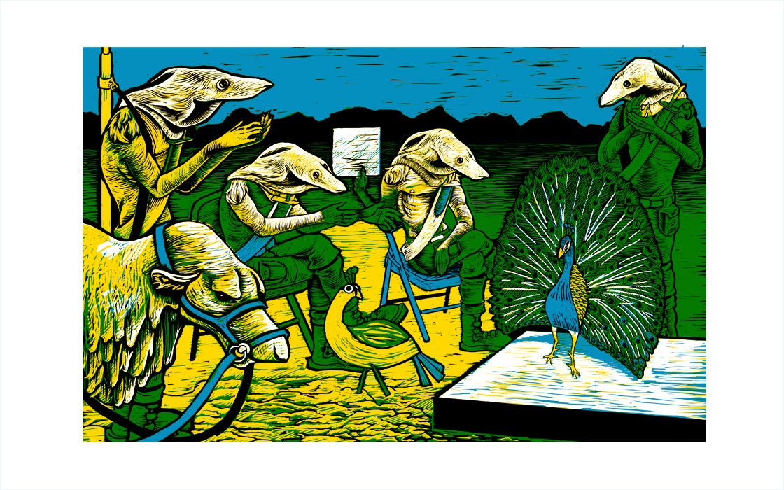
Aardvark Scouts Day 7: Final Computer Rendering

I think I am done in regards to what I want the print to look like. I can not proceed in the process because I am still waiting on a catalog from Graphic Chemical so I can look at ink colors to order. I ordered a hand-roller the other day from their online store and requested/bought another catalog. Hopefully they will send the roller quickly and will include a catalog in the box.

Tuesday, June 14, 2011

Aardvark Scouts Day 6


It's almost there. After flipping the image, I decided the clapping Scout on the left needed to be moved over. Unfortunately, with the way my layers are set up, I couldn't do this without having to redo some areas. After I fix the white gap left between him and the peacock I want to work on getting rid of some of the yellow in the image. It feels a bit overbearing at the moment.

Sunday, June 12, 2011

Aardvark Scouts WIP Day 5 and Kammal Reference Sheet


I didn't get much done today regarding the print. I mostly worked on the peacock's feathers which is making me dread the idea of carving all of it out three times D: I spent much of my working day on a reference sheet for the Aardvark Scouts' riding steed, the Kammal. I'm not an expert on biology/ zoology by any means, so I hope I can be forgiven if some of the information sounds implausible.

Thursday, June 9, 2011

Aardvark Scouts WIP Day 4

It's getting there! I've decided that this will be printed with three separate blocks (something I've never done before). I'm hoping by printing yellow on top of blue, I will gain a forth color--green. Unfortunately I do not have the inks on hand to test this theory. The company I want to order from, Graphic Chemical, is being very slow mailing their catalog and their website has no color swatches. I may break down and order what I think I want/need, but I'd really like to see what I'm buying. As much as I love thier products, they really don't seem to care about their business in regards to showing off their products or making it easy for their customers to find what they want.

Wednesday, June 8, 2011

Aardvark Scouts WIP


After scanning in the original drawings, I arrange them within the composition and start working on how the final image should look. I've not done many relief prints and I'm finding it difficult to make up my mind on how many colors I want and where I'd like to put them. I thought starting with the lightest color and moving to darkest would be the way to go, but not far into it, I decided to work out the black areas first.

Sunday, May 29, 2011

Aardvark Scouts Line Drawings


During my two month summer break I plan to create at least two relief prints centered around some old characters of mine called The Aardvark Scouts. In college, I created a portfolio of prints centered around these character. The purpose of continuing this series is to replace some weaker images in the portfolio in the hopes of strengthening it enough to apply to graduate school. I will attempt to upload progress shots of the process here.

First up are the initial drawings I do of the characters that will be in the print. The poses are pulled from the thumbnail sketch I chose to follow of the layout of the whole piece. I like to draw the characters individually on paper, scan them, then arrange them compostionally on the computer. I like this method because it allows me to easily arrange, resize and edit the subjects without having to do a lot of redrawing. I don't necessarily have to outline them since most lines will be redone or worked over while coming up with the final image, but it's a habit I picked up in school that I don't care to quit.