Friday, December 9, 2011

Slight Delay

Apologies for skipping over the test run with the yellow. Needless to say it worked. With that done and being satisfactory, I decided it was time to move on to the good paper which is 22" x 30" Rives BFK. I printed the blue block first with only minor frustrations (mostly regarding ink consistency). On the next day, it was time to print the yellow. I expected to have a few misaligned prints, but after about 6 ruined images, with no solution in sight, I was beginning to have fits. I tried various way of getting the paper to line up correctly, but to no avail! Eventually, I got to looking and noticed the sintra was no longer on the original line I had drawn on the board to glue it to. Here is the main reason nothing was registering:

Anyway, I am reglueing the Sintra back to the board tonight so hopefully printing will resume tomorrow.

Sunday, November 13, 2011

Print Test with Black and Blue + Problem Solving

After I finished carving the blue block it was time to run some tests to see if it lined up with the black. The first step in this process was to roll out the blue ink and print a few sheets, making sure to line up the corner in the registration keys.


As a side note, I have to say I really dislike the blue ink. It has a very low viscosity, is very messy getting out of the can and prints inconsistently. In the future, when I need a similar blue, I will try a different brand.


After printed three sheets of paper with the blue, I switched to printing on the black block. Like the blue block, I made sure the paper corner fit into the registration key before letting the paper fall into place. Here's what came out:

Oh the horror!

When starting this project I feared that I would have problems getting all the colors to line up correctly. Seeing this was disheartening because it could be caused by a multitude of reasons. The one I feared most was that the transfers somehow became distorted when transferring the xerox copies to the Sintra, which in turn would cause me to carve in the wrong places.

My next step was to determine what the problem was. I ran some more prints with the blue block, paying close attention to how the paper was falling after being placed in the registration key. I measured the margins in a few prints and discovered that some were off as much as half an inch while others weren't off much at all! This led me to believe that despite being aligned in the corner, the paper was shifting when it was supposed to be falling into place.

To double check to see if my transfers were an issue, I cut the margins off one of the blue prints. Instead of using the registration key to line up the print, I used the block itself. This picture was taken after being printed, hence why the black is already on the paper.


Oh what a relief!

Seeing that the transfers were not a problem I then proceeded to figure out a way to keep my margins. A flush image would be acceptable, but I planned for margins, so margins is what I want.

I used a ruler to measure and draw a line on the top and side margins.


While trying to use the drawn line to align the blue prints with the black block I noticed that sometimes the top and side of the paper would not lay on the line as they were supposed to.


This led me to believe that I was sometimes tearing my paper crooked. I don't know how this is possible since I am using a paper roller with a straightedge bar to tear with.


At any rate, I began focusing on aligning my paper on the top margin since that side of the paper was not being torn. This picture was taken after the image had been printed and dried:


In the future, I may end up gluing some extra registration keys further down on the block, but for now I will stick with the lines for aligning my paper. It may slow the printing process down a little, but I am not really concerned with time and I worry that the keys may become more of a problem than a solution. Also, while running my last print, I accidentally had my block crooked and the registration keys were scraped off by the press.

I think it's a sign that I shouldn't bother with the corner keys


There were a few places in the blue block that I want to go back into. Two places in particular stood out to me as needing to be fixed. One was the peacock's feet and the other was the arm of the scout standing behind the peacock.


These are very minor fixes and like the black block, I will wait and come back to them after the yellow block is carved and tested.
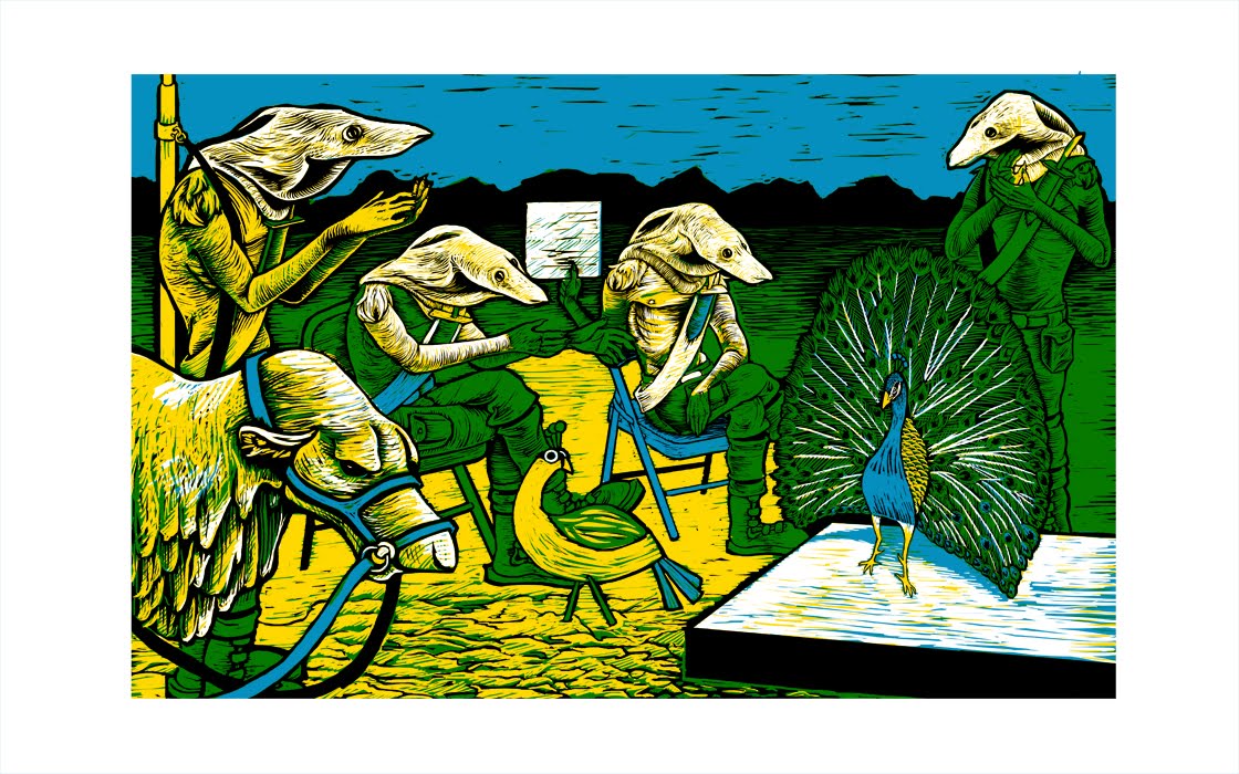
Saturday, October 29, 2011

Carving Tools

Before getting into another long blog post, I thought I'd share some photos of the carving tools I use.

The short one on the left with the round handle is the only European style gauge I use. The ones on the right with the long handles are the Japanese-style gauges (and chisel) I use. I don't prefer one over the other in regards to comfort while carving. I do find this Japanese set to have more uses hence why I use more of them. This particular set cost about $30 at Graphic Chemical. The European set costs about $40. Luckily I did not buy the European set.


Below is a close-up of the blades. From left to right: Small "V" gauge, small "U" gauge, chisel, large "U" gauge, and large "V" gauge. While I find myself using more tools from the Japanese set, the one European small "V" gauge is probably the tool I've been using the most while working on this print. It is very good at creating small, thin lines. Luckily, it stays sharp with only occasional sharpening.

The "U' gauges are better for larger areas, but they don't feel as sharp as the "V" gauges.


As for the chisel, I used it a lot with the black block in very tight, detailed areas. The technique with it is different than the other tools. I would take the point of the blade and carve around the edge of a shape, then I would come back in at a slight angle to slice the piece off. It's very time consuming, but it was necessary to get the details I wanted. Here is a crude illustration that I made of the technique.


Now back to carving!

Monday, October 10, 2011

Test Print with Black Block

In a future post, I will try to do a proper introduction of my press. I did not realize that I had not done this until half way through this particular post.

The first block I decided to carve was the black one. I am glad I chose to do this first because it was extremely tedious and detailed. Apologies for the poor image quality.


To carve this, I used a variety of both Japanese and European style gouges. I will try to post pictures of them in my next post. It is not necessary to carve very deep since the roller does not typically deposit ink into carved areas. You will see the exception to this in the test print below.


Here's a picture of the printing supplies. To the right is a sheet of glass that the ink will be spread onto with a paint knife. Knead the ink with the knife until it becomes more pliable. Afterwards, the ink is gathered with the knife and arranged in a strip across the top of the glass. From there, the roller is used to bring small amounts of ink from the strip down onto the lower portion of the glass. Roll the roller quickly until the ink is consistently distributed on the roller.


From there, slowly roll the roller across the surface of the carved block. It may be necessary to do several passes depending on how much ink is on the roller, how big your roller is, and how big your block is. In the above image, ink has been rolled onto the block, but more is needed to fill in the more splotchy areas. Once the block is inked up, I place a sheet of newsprint over the image. I intend to use nice paper in the final edition, but as a test, newsprint works just fine.


Over the paper, felt blankets are laid down. As far as I know, they serve as cushions to help buffer the pressure of the press. In the above image, I have a corner lifted up so that you can see the layers. Typically, three different blankets are used, but for this I only used two.


The next step is to find an appropriate pressure so that the ink will transfer onto the paper when rolled through the press. When the lever is pulled down, the roller under the print bed (the black board) is raised so that the bed and the printing block are pressed against the top roller. If there is not enough pressure between them, the top roller can be lowered by turning the middle knob.


There is no need to worry with the two smaller outside knobs, if they do not interfere with adjustment of the roller. They are used when doing intaglio prints.

I typically like to start feeling resistance in the lever when it reaches the point pictured above. To operate the press, the lever must be pulled down all the way.


Once an appropriate pressure has been found, hold the switch in the direction the print bed needs to go. When doing relief prints, one may choose to roll the block through one way, then go back the other. I did not feel this was necessary in this instance.

Gently remove the blankets. Then gently take the edge of the paper and pull it up and off to see the print!

Ta-da!!

I am very pleased with this test print. From what I can tell, it is very close to the computerized version. There are a few areas which I forgot to carve, so I will go back in later to do those small bits. The lighter area of the peahen is probably due to me not being consistent with the ink I rolled onto the block and can be easily fixed when it comes time to get serious. Some areas in the sky and on the stage that were supposed to be white caught some ink from the roller because they are fairly large areas. For now, I will leave them alone to see how they look with the other two colors. If I do not like it, I can either try to carve the areas out more or (for the sky) I can make what is called a frisket to cover over the inked area to keep it from printing.

Tuesday, September 20, 2011

Tranfering Images and Creating Registration Keys

Sorry for the delay in updating. Work keeps me busy and editing photos and writing a blog are not on my list of "fun" or "relaxing" activities.

In this post I will go through how I transfer images onto my matrices so that I don't have to redraw what I've already drawn on the computer and also how I set up my registration keys so that when I print multiple colors they will all (hopefully) line up properly.

For this edition I wanted to try carving on a material called Sintra, which is a dense PVC foam board. I discovered this material while working at a sign shop and assume that it can be bought at most other sign shops. It comes in many colors, but since I will be transferring a dark image, I bought a light color (cream). After trimming the Sintra down to the image size, I cleaned it with a rag and some Simple Green.


As for the transfer sheets, I converted each color layer to a black and white file. Then, I went to Kinkos and had them printed. It is important that the images are printed from a laser jet or xerox machine. The toner on the paper is what transfers to the block. Below is the transfer sheet for the yellow block. Regular printing paper is fine. No need for fancy paper stock.


To transfer the image to the block I used gloves, tape, a rag, and Acetone.


I taped the transfer sheet face-down to my clean Sintra, being careful to line up the corners.


Dampening the rag with acetone, I begin rubbing the back of the transfer sheet. This can be tricky. Too much acetone will ruin your image and too little acetone will also ruin your image. With these blocks I started rubbing from the middle working out. I think in the future I will start from one end and work towards the other.


Here is the finished transfer. I am not sure why it came out so spotty. In the past, my transfers have come out clean and consistent. Perhaps it was the Sintra, perhaps something else? As ugly as it looks, closeup, I can still see all the details to carve by.


Ok. After transferring all my images, I mounted each of them on a Masonite board. I did this for two reasons. One, Sintra can break and warp. Two, I glue my registration keys on them. To place the Sintra, I measure out my margins at the top and one side of the Masonite then add .5'' to each. I use contact cement to glue the Sintra down.


The .5'' are added because I cut rectangular pieces of linoleum floor tile that are .5'' wide by 1.5'' long. I just happen to have the floor tile. If I did not have that, scrap Sintra would do.


I then arrange and glue two pieces in the corner so that they make a right angle. This raised area will allow me to place the corner of my printing paper in the same place every time I print. I've seen some people carve their registration marks into their board (like Japanese printers), but I prefer this raised method.


Here are all three blocks ready to be carved. The top one has a shorter piece of Masonite, but it should not interfere with printing:

I am hoping by the time I am ready to do another relief print, my local print shop will have a printer that can reliably print on Sintra. This would save a good deal of time and create a cleaner image to carve by.

Thursday, July 21, 2011

Getting Everything Together

The Graphic Chemical catalog finally arrived!!! It's been over a month since I ordered this one and almost three months since I requested a free one (which has yet to arrive).


Here is the only page I was interested in. I am making the decision to use water-based inks because I will be printing in the kitchen of my house. While I could open windows for ventilation, I would still have to clean my supplies in the kitchen sink, which doesn't sit well with me. As much as I love the look of oil-based ink, water-based inks just seem like a safer, easier alternative.


Not long after the catalog arrived, my hand roller arrived! It mostly looks like a huge rubber rolling pin. The blocks of wood on each end are just a temporary stand. While I think this type of roller is meant for lithography, I used one while I was in school for a large relief print and liked the weight and feel of it. Since I plan to do more large prints, I chose to get one for myself. The brayers I keep finding are a bit too small for my taste.


While it might have taken a long time for the roller and catalog to arrive, the ink came less than a week after I ordered it. I ordered black, peacock blue, and lemon yellow. The colored bands are pieces of tape to help keep the lids on and air out.


I scraped some blue ink on the paper I intend to use with a paint scraper. After it dried, I scraped yellow on top of it. The green and blue are both way too dark. I am not really sure what I am going to do about the situation.


Here is some ink spread on a piece of glass. Before I go and buy additives or other inks I wanted to see what the blue looked like when rolled out on a block and printed. The messy blob to the top left is a piece of wax paper that is kept in the can on top of the ink to help keep it from drying. Despite the lid, tape, and wax paper, the blue had already started developing a skin on top of the ink. It was a bit messy to remove and discard. I don't like letting it stay in the can because it could break up and get into the usable ink.


I got a few things with the press I bought. One of them was this mystery canister of what I think is extender. This is added to the ink on the glass to stretch it out and keep it from drying as fast. I added a good bit to my test pile to see if it made the blue more transparent when printed.


Here are the results of my tests with the blue. The topmost piece is the scraped on blue and yellow that was shown above. The rest are in consecutive order as I work the test block up to print. The splotchiness bothers me. I am not sure if it's due to the extender I added to the ink, or if it's the ink itself. I still feel that the blue may be too dark, but I will see what happens when I print yellow on top of it.

Thursday, June 16, 2011

Aardvark Scouts Day 7: Final Computer Rendering

I think I am done in regards to what I want the print to look like. I can not proceed in the process because I am still waiting on a catalog from Graphic Chemical so I can look at ink colors to order. I ordered a hand-roller the other day from their online store and requested/bought another catalog. Hopefully they will send the roller quickly and will include a catalog in the box.

Tuesday, June 14, 2011

Aardvark Scouts Day 6


It's almost there. After flipping the image, I decided the clapping Scout on the left needed to be moved over. Unfortunately, with the way my layers are set up, I couldn't do this without having to redo some areas. After I fix the white gap left between him and the peacock I want to work on getting rid of some of the yellow in the image. It feels a bit overbearing at the moment.

Sunday, June 12, 2011

Aardvark Scouts WIP Day 5 and Kammal Reference Sheet


I didn't get much done today regarding the print. I mostly worked on the peacock's feathers which is making me dread the idea of carving all of it out three times D: I spent much of my working day on a reference sheet for the Aardvark Scouts' riding steed, the Kammal. I'm not an expert on biology/ zoology by any means, so I hope I can be forgiven if some of the information sounds implausible.

Thursday, June 9, 2011

Aardvark Scouts WIP Day 4

It's getting there! I've decided that this will be printed with three separate blocks (something I've never done before). I'm hoping by printing yellow on top of blue, I will gain a forth color--green. Unfortunately I do not have the inks on hand to test this theory. The company I want to order from, Graphic Chemical, is being very slow mailing their catalog and their website has no color swatches. I may break down and order what I think I want/need, but I'd really like to see what I'm buying. As much as I love thier products, they really don't seem to care about their business in regards to showing off their products or making it easy for their customers to find what they want.

Wednesday, June 8, 2011

Aardvark Scouts WIP


After scanning in the original drawings, I arrange them within the composition and start working on how the final image should look. I've not done many relief prints and I'm finding it difficult to make up my mind on how many colors I want and where I'd like to put them. I thought starting with the lightest color and moving to darkest would be the way to go, but not far into it, I decided to work out the black areas first.